REDEFINING CHARITABLE GIVING
Charitysub.org
CharitySub.org was a philanthropic monthly subscription service that I cofounded. Each month CharitySub championed a new cause, and hand-picked 3 small charities working within that cause. Subscribers donated $5 to the charity of their choice each month.

ROLE ON THIS PROJECT
Design strategy, wireframes, prototypes, visual design, art direction
As Cofounder and Principal Designer for this little start-up I wore many hats over the three years of its existence. I worked closely with my three cofounders to develop the product concept from initial ideation to fully functional website over three major iterations. I was the principal designer on the project, but occasionally worked with a freelance graphic designer (Amy Fuller) to develop the UI, and a freelance copy editor (Salina Cole) to create editorial content.
THE PROBLEM
Problem Statement: An average person does not give to charities because they feel overwhelmed by the choices involved and unsure a small donation could make a difference.
Hypothesis: We believe that by developing a collective donation service that takes the guesswork out of charitable giving, we can help inexperienced philanthropists make a meaningful impact for small organizations.
From the beginning my design goals were twofold—gain new members and then engage them with the content.
VERSION 1
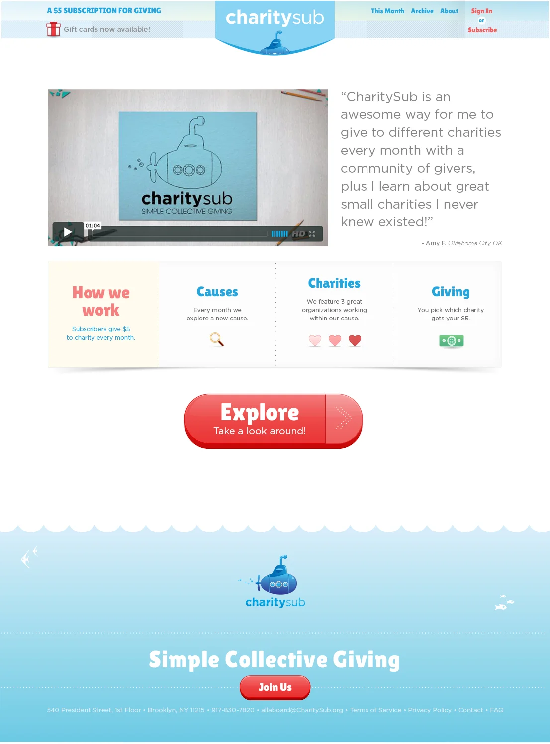
The home page was basically a sales tool designed to convert new users to members.
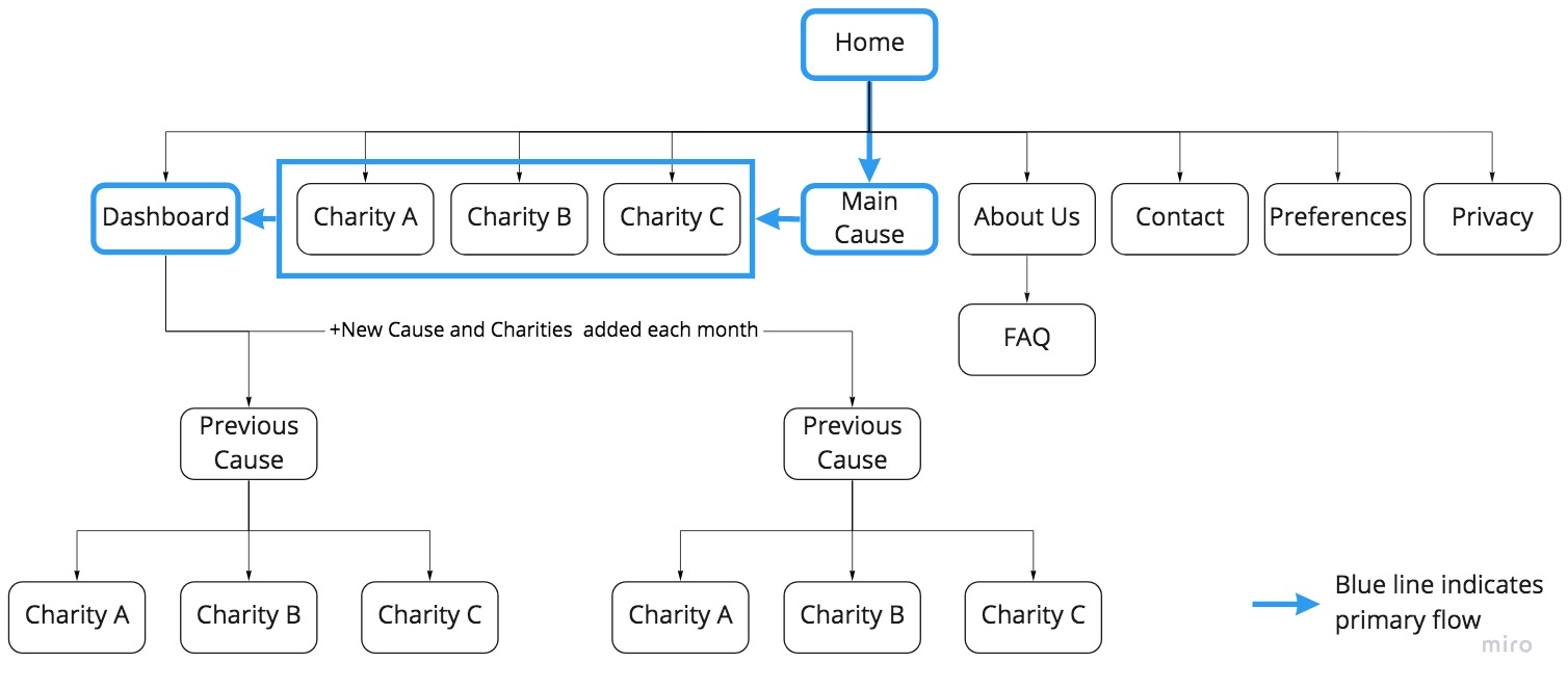
Members would bypass the home page and be directed into our charity selection flow: Cause Page > Charity Page > Member Dashboard.
(click images below to enlarge)


HOMPAGE V1
The homepage was mainly a sales tool to help us gain new subscribers. Our goal was to both educate the user about our organization and quickly move them through the check-out process before interacting with our service. In our first iteration, we designed the home page around this goal, prominently featuring a whimsical stop-motion video which described the general product concept. I worked with an animator by providing art direction, assets, storyboards and a script. The video concept closely matched our problem statement and hypothesis, effectively educating our users about the new service. All four cofounders participated as actors in the stop-motion animation process. The video became a very useful sales tool that gave us credibility and brought our brand to life.
CAUSE & CHARITY PAGES V1
The cause and three charity pages were the core experience for our members each month. The cause page featured articles and graphics which I produced that explained the cause and why our members should care. We created a page for each of the three charities which explained how they were impacting our monthly cause. These four pages each featured a high production value video which we created in collaboration with our partner, Plywood Pictures. We believed that the videos would be the main information source for most users.
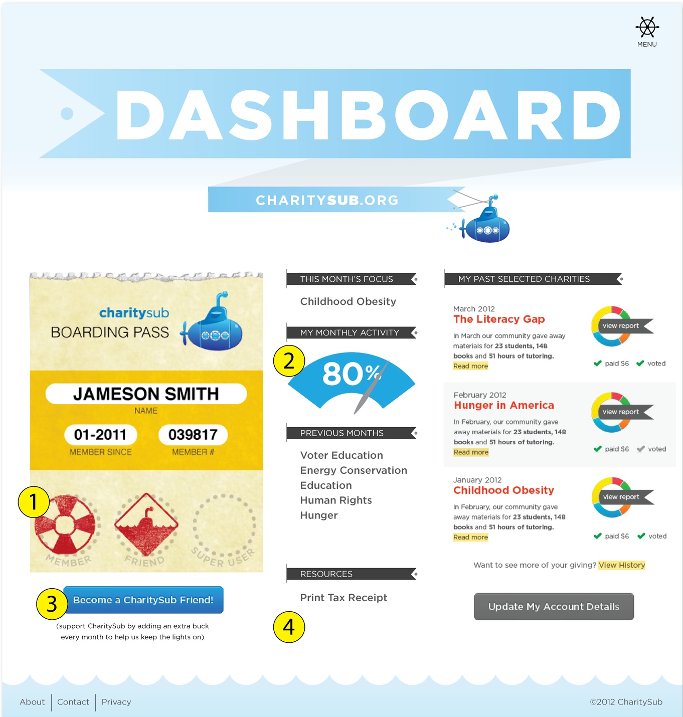
DASHBOARD
The on-boarding flow ended on the user’s dashboard page, where the user could see their account details. We developed a visualization of the user’s status called the “boarding pass” that was prominently displayed during checkout and on the user’s dashboard. Through increasing involvement with the organization, the user could earn stamps for their boarding pass and upgrade their status. The idea was that through gamification elements like earning badges, we could motivate users to get more involved. Part of the business model was that subscribers had the option to donate an additional dollar every month to support the CharitySub organization itself—this was one way to earn a stamp. They could also earn stamps through social sharing, and recruiting new members. The gamification elements visually showed users how to get the most out of our service.
Immediately after launch we began considering plans to improve the experience. Interviews with users and a consultation with a usability expert helped us identify some problem areas.
OPPORTUNITIES TO IMPROVE
Home page—Simplify content, branding competes with cause and charity sections.
Navigation—Menu nav box is limiting and not intuitive.
Reconsider language for selecting charities— “Vote” vs. “Select” vs. “Give” vs “Choose”
Past causes are hidden for non-members because navigation is located on user dashboard.
Add gifting option
VERSION 2
(click images below to enlarge)


V2 REDESIGN SUMMARY
Home Page—simplified content, removed animation, simplified footer, new CTA focuses on new subscribers
Added navigation bar—
Cause Page—added a new header to give past/present/future context to our continuum of causes
Added Archive Page—Allowed navigation to all past content
Added Gift Cards—delivery options, printable pdf
RESULTS
We released version 2 about nine months after our initial launch. It didn’t take long to see what was working and what wasn’t. Testing showed that our V2 homepage was not compelling. We saw a decline in new subscriber growth, but analytics showed that a majority of our new subscribers came through social channels which presented an opportunity. We saw engagement from long-time subscribers declining, and charity selection habits were dwindling. User interviews indicated that there was an overwhelming amount of information on our cause and charity pages—users felt like CharitySub was homework. Our video content was not being utilized to the extent we initially expected—users liked to scroll/skim and showed a preference for content that was supported by graphs and images. Users liked to share more intricate graphics on social media. The gifting feature was very well received, and provided a significant boost of new subscribers around the holidays.
VERSION 3
(click images below to enlarge)


V3 REDESIGN SUMMARY
Home Page— simplified content, reintroduced our original animation, added testimonial, clear CTA ushering new users into our “choose” flow
Cause Page—renamed to “explore” page, added progress tabs to indicate steps in flow, replaced video with hero image, replaced articles with large infographic, templatized content to reduce work on backend, moved charity selection module to next page in flow, clear CTA for next step
Charity Page—renamed to “choose” page, Consolidated 3 pages of content to 1 page, added real-time community selection graph, encouraged a community discussion with our facebook commenting module, clear CTA for next step
Share Page—added a new “share” step to the flow
Footer—added “how we work” info on all pagers other than home
My main goal with the V3 redesign was to effectively guide users all the way through the funnel. To do this, I made it extremely clear what the user should do at each step by adding clear calls to action and a progress indication bar. I also streamlined the content on the cause page and consolidated the charities onto one simplified page. I integrated sharing on social media throughout by encouraging users to share our infographics and publicly comment on our content. We implemented a facebook integration that auto-shared a user’s selection if they chose to connect.
WIREFRAMES
I worked out the kinks for V3 by testing wireframes with new and existing users. I changed the flow so that users could select a charity for their donation before entering in their credit card information. Testing suggested that as users went through the funnel they built trust in our organization, becoming more emotionally invested in their choices, and this would drive greater conversion for membership.
(click images below to enlarge)


STREAMLINING CONTENT
Testing and analytics showed that users were less engaged with some of the content than we had initially expected. We observed that users appreciated the information we presented when they started their membership, but over time they were not interested in reading long articles about our causes and charities every month. Furthermore, every month we produced expensive videos for each of the three charities and the cause, and saw declining engagement over time for that content as well. We had very limited funding, so this was a big concern.
I redesigned the cause page to eliminate our long informational articles, replacing them with one large sharable infographic that could easily live off the site as a stand-alone image (more on that here). Eliminating the videos saved a lot of resources, while the new cause page template eliminated the need for our developer to make custom pages every month.
EMPHASIS ON SHARING
The new flow ended on a “share” page instead of the user’s dashboard. The share page featured a custom graphic that they could easily post on social media, and prominent social sharing buttons with a clear CTA to essentially brag about their donation.

V3 RESULTS
Feedback and analytics suggested that the redesign was a success. Unique visitors increased 33% from our social sharing campaigns. Analytics also showed a 20% increase in visits to user’s dashboards after the redesign, which indicated that more users were making it all the way through the flow.
The redesign also streamlined the workflow for our team—templating monthly content, and eliminating the need for four new high production value videos every month which freed up resources for other development efforts and extended our runway.
REFLECTIONS
With a 20% increase in visits to user’s dashboards, this was an opportunity to further engage our users that I would have liked to explore. Further user testing could have helped me optimize this page, and develop more useful features.